
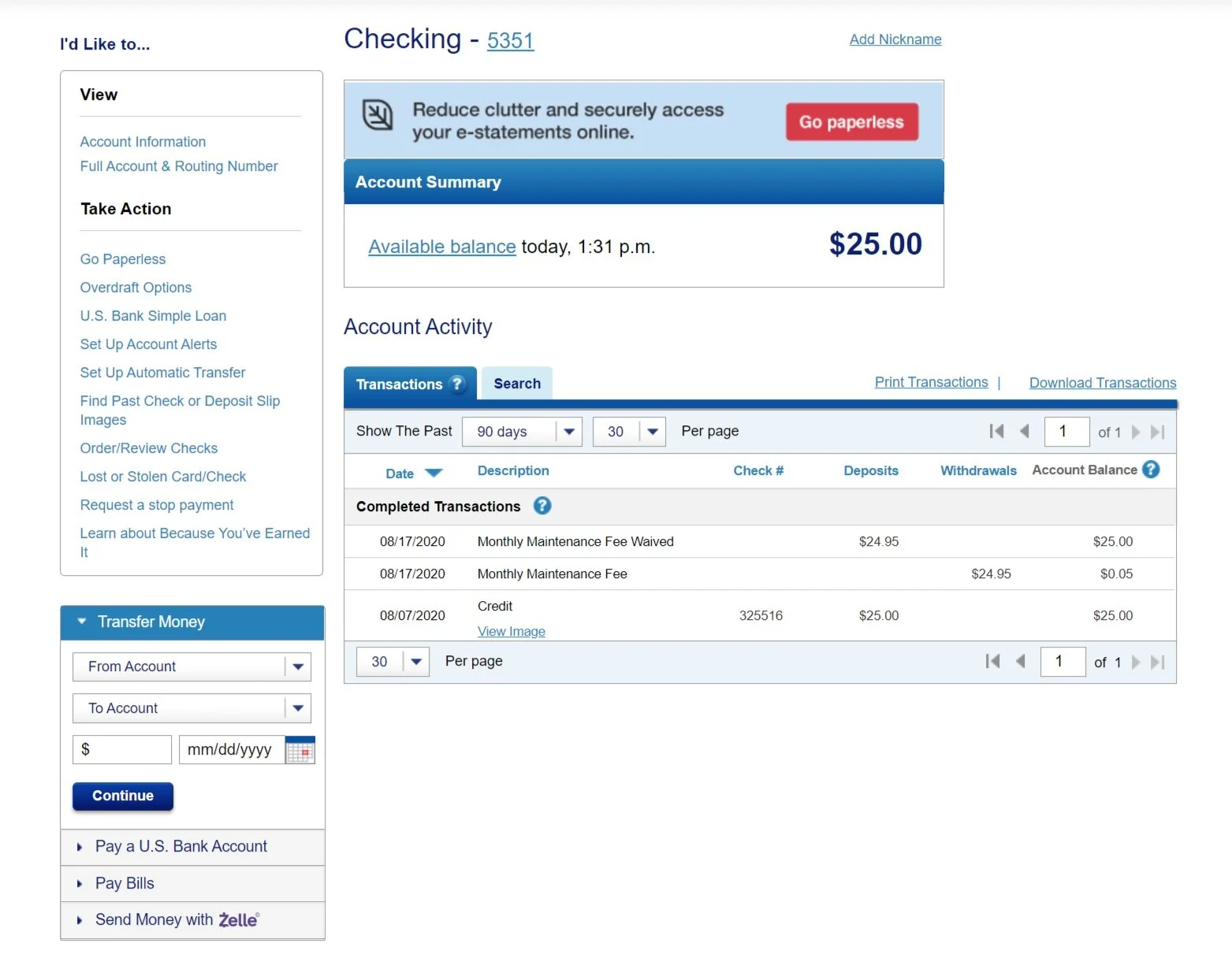
Contextual navigation for all U.S. Bank account types
We were building a whole new online banking platform. We knew we’d have a fractured navigation on day one. There was no getting around it. The question was, how would we help customers find their most important account actions quickly?
Role: UX content strategist
Scope: Create a contextual navigation and taxonomy that can be applied across all U.S. Bank account types.
Goal: Give users easy access to the core tasks for each account type.
Audience: 4.5 million consumer and small business customers
Constraints: Links can’t be removed, label text can’t change significantly and the design/taxonomy has to accommodate any new links.
Discovering and defining the problem
Online banking has had a contextual navigation for years. But, the team thinks of it as a UX junk drawer that delivers little to no value.
To identify the true problems and opportunities, we aligned with three key groups:
Analytics showed that the legacy widget was used by fewer than 3% of our active users each month.
Product wanted to give easy access to new DIY workflows to reduce call volume.
Our backend development partners identified 10 different account types and the links/behavior associated with each one.

A research-backed taxonomy
My team wasn’t sure how to approach a contextual navigation. I worked with our researcher to develop a research-first approach.
We started with an open card sort.
The experience architect and I created buckets and labels based on the results.
We ran a closed card sort to validate the buckets and labels.
The closed card sort showed that two links didn’t clearly fall into a single bucket.
We decided to create two taxonomy variations to see if we could gain further insights in an unmoderated test.
Using remote unmoderated testing to refine our designs and taxonomy
We ran two rounds of testing remote unmoderated testing to refine our UI, validate our taxonomy, and test the scalability of our solution. During our tests we presented participants with two versions of our most common account types.
This research led us to an important, but expected conclusion. Users preferred the cleaner design that had the menu accordions collapsed. They said they preferred it, even though the research proved that they had a more difficult time using it and a lower success rate.
Based on this initial feedback, we were able to make tweaks to our taxonomy and labeling and identify a new design approach. By expanding the first accordion in the menu on load, we were able to show users how the accordions worked while maintaining a clean design.


Key outcomes
Created a taxonomy that could be adapted and consistently applied across 10 account types
Aligned link labels with U.S. Bank’s voice and tone guidelines
Enhanced design system components
Created a quick link design pattern and taxonomy that’s being used by multiple teams
Added links to newly developed DIY features to contribute to the business outcomes of other product teams
Gave users easy access to critical security and account servicing features
Maximized the value of user research within the team and organization
Contact me
I’d love to learn more about you. Let’s talk.
I’m always interested in building my network, learning about projects, and exploring new opportunities.